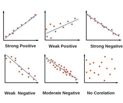
A scatter plot is a type of data display that shows the relationship between two numerical variables. Each member of the dataset gets plotted as a point whose x-y coordinates relate to its values for the two variables.
In a scatter plot, the closer the data points come to forming a straight line, the higher the correlation between the two variables, or the stronger the relationship. If the data points make a straight line going from near the origin out to high y-values, the variables have a positive correlation. On the other hand, if the data points start at high y-values on the y-axis and progress down to low values, the variables have a negative correlation.
For example, consider purchasing candy bars for $1 each. As the number of candy bars increases, the total cost also increases, resulting in a perfect positive correlation. Another example is the relationship between the number of hours students spend studying for an exam versus the grade received. While there may be some individual variations, the trend will generally hold true that as the amount of time studying increases, so does the grade received.
On the other hand, if the data points are spread out and do not follow a clear pattern or trend, it indicates no correlation between the two variables. In this case, there is no systematic relationship between the variables, and they may be randomly distributed across the plot.
Scatter Plots with No Association
A scatter plot with no association refers to the absence of a clear pattern or relationship between the two variables being plotted. While scatter plots with no association may sometimes exhibit clustering of data points, especially if there's random variation or noise present in the data, this is not a requirement.
In fact, scatter plots with no association can have data points scattered across the plot with no discernible pattern or trend. It is essential to examine the overall distribution of points to determine whether there's any systematic relationship between the variables or if they're randomly distributed. If there's no apparent relationship, it is classified as having no association.
Example: Precipitation and Umbrella Sales
Consider a scatter plot showing the amount of precipitation in inches on one axis and the number of umbrellas sold on the other axis. Which type of correlation would you expect? Making the precipitation the "x-values" and the number of umbrellas sold the "y-values", I would say that the scatter plot would have a positive correlation; people should generally buy more umbrellas as the amount of rain increases.
****, interpreting scatter plots is an important tool in data analysis. By understanding what types of correlations are present in a scatter plot, we can gain valuable insights into the relationships between variables and make informed decisions.
