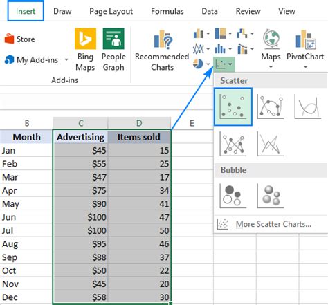
As with other chart types, nearly each element of a scatter graph in Excel is customizable. You can easily change the chart title, add axis titles, hide the gridlines, choose your own chart colors, and more.
Below we will focus on a few customizations specific to a scatter plot.
Adjust the Axis Scale (Reduce White Space)
In case your data points are clustered at the top, bottom, right, or left side of the graph, you may want to clean up the extra white space.
To reduce the space between the first data point and the vertical axis and/or between the last data point and the right edge of the graph, perform these steps:
- Right-click the x-axis, and click Format Axis…
- On the Format Axis pane, set the desired Minimum and Maximum bounds as appropriate.
- Additionally, you can change the Major units that control the spacing between the gridlines.
The below screenshot shows my settings:
Add Labels to Scatter Plot Data Points
When creating a scatter graph with a relatively small number of data points, you may wish to label the points by name to make your visual better understandable. Here's how you can do this:
- Select the plot and click the Chart Elements button.
- Tick off the Data Labels box, click the little black arrow next to it, and then click More Options…
- On the Format Data Labels pane, switch to the Label Options tab (the last one), and configure your data labels in this way:
- Select the Value From Cells box, and then select the range from which you want to pull data labels (B2:B6 in our case).
- If you'd like to display only the names, clear the X Value and/or Y Value box to remove the numeric values from the labels.
- Specify the labels position, Above data points in our example.
That's it! All data points in our Excel scatter plot are now labeled by name:
Tip: How to fix overlapping labels
When two or more data points are very close to each other, their labels may overlap, as is the case with the Jan and Mar labels in our scatter diagram. To fix this, click on the labels, and then click on the overlapping one so that only that label gets selected. Point your mouse cursor to the selected label until the cursor changes to the four-sided arrow, and then drag the label to the desired position.
As the result, you will have a nice Excel scatter plot with perfectly legible labels:
Add a Trendline and Equation
To better visualize the relationship between the two variables, you can draw a trendline in your Excel scatter graph, also called a line of best fit.
To have it done, right-click on any data point and choose Add Trendline… from the context menu.
Excel will draw a line as close as possible to all data points so that there are as many points above the line as below.
Additionally, you can show the equation for the trendline that mathematically describes the relationship between the two variables. For this, check the Display Equation on Chart box on the Format Trendline pane that should appear in the right part of your Excel window immediately after you've added a trendline. The result of these manipulations will look similar to this:
What you see in the screenshot above is often called the linear regression graph, and you can find the detailed guidelines on how to create it here: How to make a linear regression graph in Excel.
How to Switch X and Y Axes in a Scatter Chart
As already mentioned, a scatter plot usually displays the independent variable on the horizonal axis and the dependent variable on the vertical axis. If your graph is plotted differently, the easiest fix is to swap the source columns in your worksheet, and then draw the chart anew.
If for some reason rearranging the columns is not possible, you can switch the X and Y data series directly on a chart. Here's how:
- Right-click any axis and click Select Data… in the context menu.
- In the Select Data Source dialog window, click the Edit button.
- Copy Series X values to the Series Y values box and vice versa.
- Tip. To safely edit the contents of the Series boxes, put the mouse pointer in the box, and press F2.
Click OK twice to close both windows.
As the result, your Excel scatter plot will undergo this transformation:
Tip. If you need to find a specific data point in a graph, this tutorial will teach you how to find, highlight and label a data point in a scatter plot.
That's how you create a scatter plot in Excel. In our next tutorial, we will continue with this topic and show how to quickly find and highlight a certain data point in a scatter graph. Please stay tuned!
You may also be interested in:
[Insert links or topics here]
