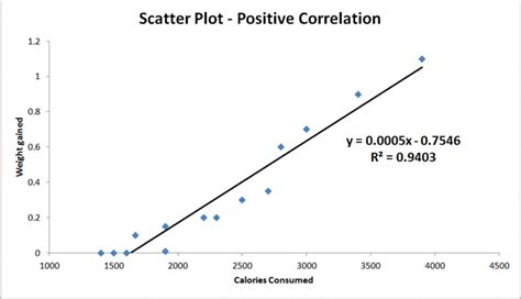
In this article, we will explore the world of scatter plots, a fundamental data visualization tool used to investigate relationships between two numeric variables. A scatter plot is a graphical representation of data points that shows the relationship between two variables, allowing us to identify patterns, trends, and correlations.
What is a Scatter Plot?
A scatter plot is a graph that displays the relationship between two continuous variables, typically represented by x-axis (horizontal) and y-axis (vertical). Each data point is represented as a dot on the graph, with the position of the dot determined by its corresponding values in the two variables.
Types of Scatter Plots
There are several types of scatter plots that can be used to visualize relationships between variables. Some common variations include:
- Basic Scatter Plot: A simple scatter plot showing the relationship between two variables without any additional information.
- Categorical Third Variable: Adding a third categorical variable, which is often represented by color or shape, allowing us to see how different groups relate to each other.
- Numeric Third Variable: Using size or color to represent values of a numeric third variable, providing additional insights into the relationship between variables.
- Connected Scatter Plot: Displaying connected data points over time, which can be useful for showing trends and changes in relationships.
- Heatmap: A type of scatter plot that uses shading or colors to represent density or frequency of data points.
Features of Scatter Plots
Scatter plots have several key features that make them useful for analyzing relationships:
- Correlation Coefficient: A measure of the strength and direction of the relationship between two variables.
- Trend Line: A line that best fits the data, providing insight into the pattern or trend in the relationship.
- Annotations: Text labels or notes on specific points in the graph to highlight important observations.
How to Create a Scatter Plot
Scatter plots are widely available in various visualization tools and software, including Excel, Tableau, Power BI, and many more. You can create a scatter plot using any of these tools by following these steps:
- Select the two variables you want to visualize.
- Choose a scatter plot template or design.
- Customize the appearance of your graph, such as adding annotations or modifying colors.
Best Practices for Scatter Plots
To get the most out of your scatter plots, follow these best practices:
- Choose meaningful variable names: Use descriptive and concise variable names to facilitate understanding.
- Use meaningful labels: Include informative axis labels and a title that summarizes the graph's purpose.
- Select relevant data points: Focus on the data points that are most relevant to your analysis.
- Annotate key findings: Highlight important observations or trends using annotations.
Scatter plots are a powerful tool for visualizing relationships between two numeric variables. By understanding the different types of scatter plots, their features, and how to create them, you can effectively communicate insights and patterns in your data. Whether you're an analyst, researcher, or data scientist, mastering scatter plots will help you gain valuable insights from your data.
