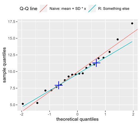
Q-Q plots are frequently used to visually inspect whether a dataset follows a specific probability distribution, such as the normal distribution. By comparing the quantiles of the observed data to the quantiles of the assumed distribution, deviations from the assumed distribution can be detected. This is crucial in many statistical analyses, where the validity of distributional assumptions impacts the accuracy of statistical inferences.
Detecting Outliers
Outliers are data points that deviate significantly from the rest of the dataset. Q-Q plots can help identify outliers by revealing data points that fall far from the expected pattern of the distribution. Outliers may appear as points that deviate from the expected straight line in the plot.
Comparing Distributions
Q-Q plots can be used to compare two datasets to see if they come from the same distribution. This is achieved by plotting the quantiles of one dataset against the quantiles of another dataset. If the points fall approximately along a straight line, it suggests that the two datasets are drawn from the same distribution.
Assessing Normality
Q-Q plots are particularly useful for assessing the normality of a dataset. If the data points in the plot closely follow a straight line, it indicates that the dataset is approximately normally distributed. Deviations from the line suggest departures from normality, which may require further investigation or non-parametric statistical techniques.
Model Validation
In fields like econometrics and machine learning, Q-Q plots are used to validate predictive models. By comparing the quantiles of observed responses with the quantiles predicted by a model, one can assess how well the model fits the data. Deviations from the expected pattern may indicate areas where the model needs improvement.
Quality Control
Q-Q plots are employed in quality control processes to monitor the distribution of measured or observed values over time or across different batches. Departures from expected patterns in the plot may signal changes in the underlying processes, prompting further investigation.
Types of Q-Q Plots
There are several types of Q-Q plots commonly used in statistics and data analysis, each suited to different scenarios or purposes:
- Normal Distribution: A symmetric distribution where the Q-Q plot would show points approximately along a diagonal line if the data adheres to a normal distribution.
- Right-skewed Distribution: A distribution where the Q-Q plot would display a pattern where the observed quantiles deviate from the straight line towards the upper end, indicating a longer tail on the right side.
- Left-skewed Distribution: A distribution where the Q-Q plot would exhibit a pattern where the observed quantiles deviate from the straight line towards the lower end, indicating a longer tail on the left side.
- Under-dispersed Distribution: A distribution where the Q-Q plot would show observed quantiles clustered more tightly around the diagonal line compared to the theoretical quantiles, suggesting lower variance.
- Over-dispersed Distribution: A distribution where the Q-Q plot would display observed quantiles more spread out or deviating from the diagonal line, indicating higher variance or dispersion compared to the theoretical distribution.
Python Code
Below is an example of how to generate Q-Q plots in Python using the numpy, matplotlib.pyplot, and scipy.stats libraries:
import numpy as np
import matplotlib.pyplot as plt
import scipy.stats as stats

# Generate data for different distributions
normal_data = np.random.normal(loc=0, scale=1, size=1000)
right_skewed_data = np.random.exponential(scale=1, size=1000)
left_skewed_data = -np.random.exponential(scale=1, size=1000)
under_dispersed_data = np.random.normal(loc=0, scale=0.5, size=1000)
over_dispersed_data = np.concatenate((np.random.normal(loc=-2, scale=1, size=500),
 np.random.normal(loc=2, scale=1, size=500)))

# Create Q-Q plots
plt.figure(figsize=(15, 10))
plt.subplot(2, 3, 1)
stats.probplot(normal_data, dist="norm", plot=plt)
plt.title('Q-Q Plot - Normal Distribution')
plt.subplot(2, 3, 2)
stats.probplot(right_skewed_data, dist="expon", plot=plt)
plt.title('Q-Q Plot - Right-skewed Distribution')
plt.subplot(2, 3, 3)
stats.probplot(left_skewed_data, dist="expon", plot=plt)
plt.title('Q-Q Plot - Left-skewed Distribution')
plt.subplot(2, 3, 4)
stats.probplot(under_dispersed_data, dist="norm", plot=plt)
plt.title('Q-Q Plot - Under-dispersed Distribution')
plt.subplot(2, 3, 5)
stats.probplot(over_dispersed_data, dist="norm", plot=plt)
plt.title('Q-Q Plot - Over-dispersed Distribution')

# Show the plots
plt.tight_layout()
plt.show()
This code generates Q-Q plots for five different distributions: normal, right-skewed, left-skewed, under-dispersed, and over-dispersed. The plots are then displayed using matplotlib.
